
Search Divi Modal Popup Documentation
Search for answers or browse our knowledge base.
Configuration
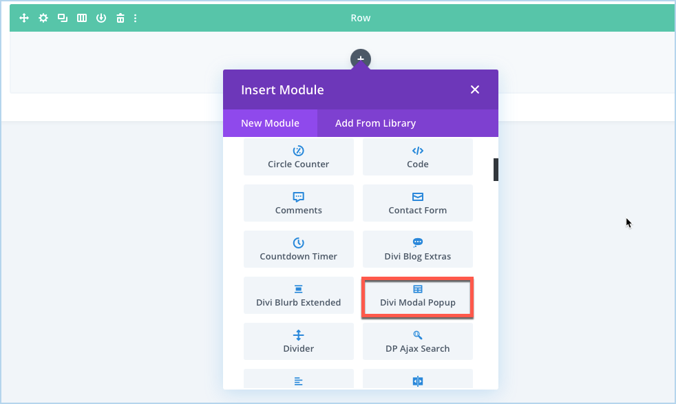
Adding Divi Modal Popup
- Create or edit a page that uses the Divi Builder.
- Create or edit a row.
- Create or edit a column.
- Go to the module options.
- Select the module Divi Modal Popup.
Content
Configuration
Unique Modal ID
Under the Configuration setting, you get this option. Enter the unique modal Id here to make it work perfectly.
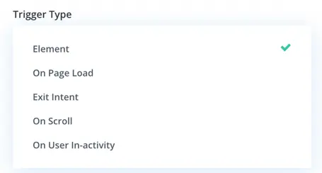
Trigger Type
To select the modal trigger type, follow these steps:
Content tab >> Configuration settings >> locate the Trigger Type option >> choose the desired trigger type from the following options:
- Element: Trigger the modal when a specific element on the page is clicked or interacted with.
- On Page Load: Trigger the modal automatically when the page loads.
- Exit Intent: Trigger the modal when the user’s mouse cursor moves towards the top of the browser window, indicating an intent to leave the page.
- On Scroll: Trigger the modal when the user scrolls to a specific point on the page.
- On User Inactivity: Trigger the modal when the user has been inactive for a specified period.
Element
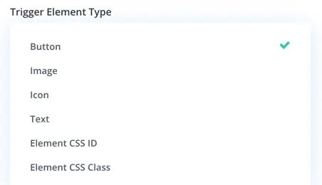
When you select the Element trigger type, you have the various options for choosing the triggering element. These options include:
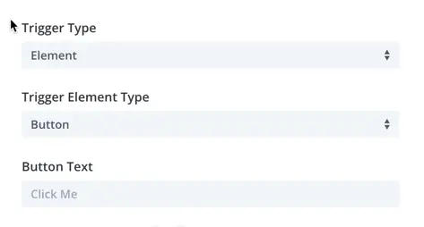
- Button: Select a button element on your page to trigger the modal when clicked.
- Image: Choose an image element on your page to trigger the modal when clicked.
- Icon: Select an icon element on your page to trigger the modal when clicked.
- Text: Choose a text element on your page to trigger the modal when clicked.
- Element CSS ID: Specify the CSS ID of an existing HTML element on your page to trigger the modal when clicked or interacted with.
- Element CSS Class: Specify the CSS class of an existing HTML element on your page to trigger the modal when clicked or interacted with.
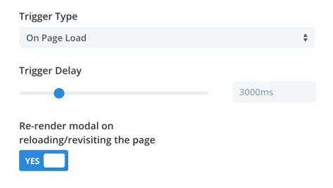
On Page Load
When the trigger type is set to “On Page Load,” you have additional options available:
- Trigger Delay: This setting allows you to specify the delay (in milliseconds) before the modal is displayed after the page loads. The default value is 3000ms (3 seconds), but you can adjust this value as needed.
- Re-render Modal on Reloading/Revisiting the Page: Enabling this toggle ensures that the modal will be rendered again when the page is reloaded or revisited, even if it was previously closed. This can be useful if you want the modal to appear every time the page is loaded, regardless of whether the user has interacted with it before.
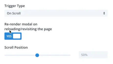
On Scroll
When you select the “On Scroll” trigger type, you are presented with additional options:
- Re-render Modal on Reloading/Revisiting the Page: This toggle allows you to specify whether the modal should be rendered again when the page is reloaded or revisited. Enabling this option ensures that the modal will appear each time the page is loaded, even if it was previously closed.
- Scroll Positions: Here, you can define the scroll position at which the modal should be triggered. This allows you to specify how far down the page the user must scroll before the modal is displayed. You can set specific scroll positions based on your requirements.
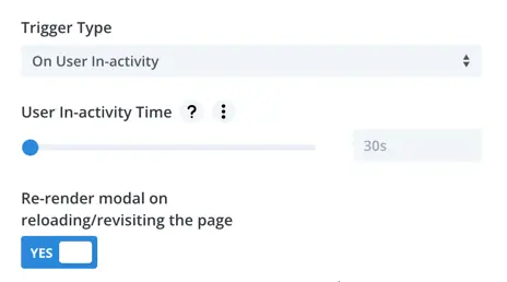
User In-activity Time
When you choose the “On User Inactivity” trigger type, you will encounter additional settings:
- User Inactivity Time: This setting determines the duration of user inactivity required before the modal is triggered. By default, it is set to 30 seconds, meaning that if a user remains inactive on the page for 30 seconds, the modal will be triggered.
- Re-render Modal on Reloading/Revisiting the Page: Similar to other trigger types, this option allows you to specify whether the modal should be rendered again when the page is reloaded or revisited. Enabling this option ensures consistent behavior if the user reloads or returns to the page.
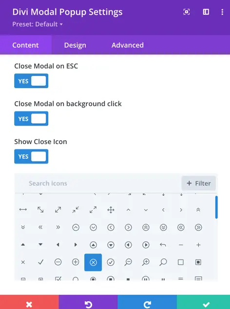
To configure the modal’s closing behavior and close icon display, follow these steps:
Close Modal on Esc:
Enable this option to allow users to close the modal by pressing the “Esc” key on their keyboard.
Close Modal on Background Click:
Enable this option to allow users to close the modal by clicking on the background outside of the modal.
Show Close Icon:
- Enable this option if you want to display a close icon within the modal.
- If enabled, you can choose the specific icon to use from the available options.
To display modal header, go to Modal Header >> check Show Header as Yes.
To set and display the modal title on the header, go to Modal Header >> check Show Modal Title as Yes, and input text in the Modal Title field.
If you want to display a close icon on the modal header, then go to Modal Header in the content tab >> check Show Close Icon as Yes.
To select modal body content, go to Content tab >> Modal Body >> and select available Modal Content Type >> Text/Image/Video/Divi Library Layout.
To display footer and close button text on the modal, go to Model Footer >> check Show Footer as Yes, and input the text in the Close Button Text field.
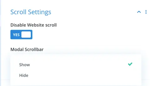
Scroll Settings
In the scroll settings of the modal, you have the following options:
Disable Website Scroll:
Enable this option to prevent scrolling of the website content behind the modal when the modal is open.
Modal Scroll Bar:
Choose whether to show or hide the scroll bar within the modal.
If you want to change the background of the Modal, Trigger Element, Modal Header, Body and Footer, go to Background, and apply customization according to the requirements.