
Search Divi Table Extended Documentation
Search for answers or browse our knowledge base.
Module
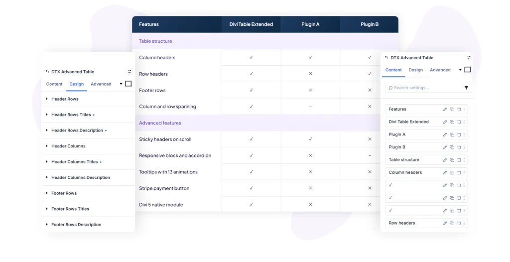
The DTX Advanced Table module displays customizable, responsive tables in Divi with support for column/row spanning, cell tooltips, sticky headers, cell icons/images, and comprehensive styling controls across header rows, header columns, general cells, and footers. This documentation details all configuration settings available under the Content, Design, and Advanced tabs of the module.
Content
1. DTX Advanced table item
Click on an individual table cell item under the DTX Advanced Table Item list to configure its content:
Content
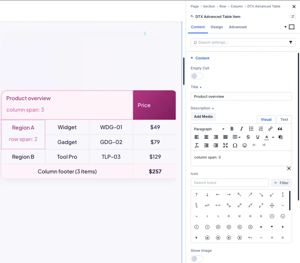
- Empty Cell:
- Control Type: Toggle (ON / OFF)
- Description: Enable to leave this cell empty without content.
- Title:
- Control Type: Text Input Field
- Description: Enter the primary title or data text for this table cell.
- Description:
- Control Type: Rich Text Editor (Visual & Text tabs)
- Description: Add descriptive body content or detailed text inside the cell.
- Icon:
- Control Type: Icon Grid Picker (+ Filter)
- Description: Choose an icon to display inside the table cell.
- Show Image:
- Control Type: Toggle (ON / OFF)
- Description: Enable to upload and display an image inside the table cell.
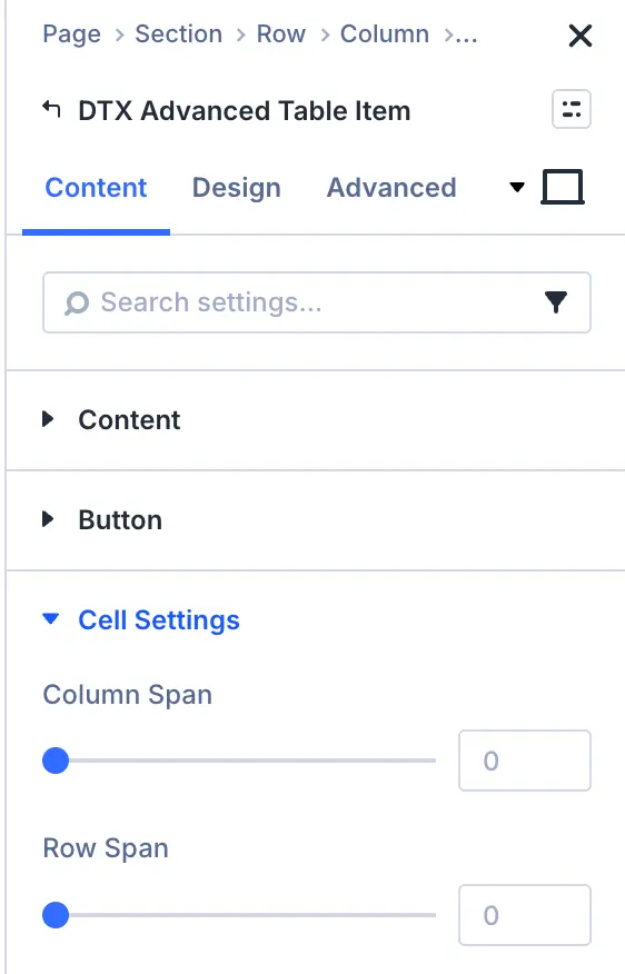
Cell Settings
- Column Span:
- Control Type: Number Input Field
- Description: Set the number of horizontal columns this cell spans across (equivalent to HTML
colspan).
- Row Span:
- Control Type: Number Input Field
- Description: Set the number of vertical rows this cell spans across (equivalent to HTML
rowspan).
Tooltip settings
- Trigger Action:
- Control Type: Dropdown (Hover, Click)
- Description: Select the user action that reveals the cell tooltip.
- Tooltip Placement:
- Control Type: Dropdown (Top, Bottom, Left, Right)
- Description: Select the popup position of the tooltip relative to the table cell.
- Trigger Icon:
- Control Type: Icon Grid Picker
- Description: Choose a specific icon to act as the tooltip trigger indicator.
- Tooltip Text:
- Control Type: Rich Text Editor (Visual & Text tabs)
- Description: Enter content and formatting displayed inside the cell tooltip popup.
2. Parent module settings
Under the Content tab of the main parent module, the following accordions are available:
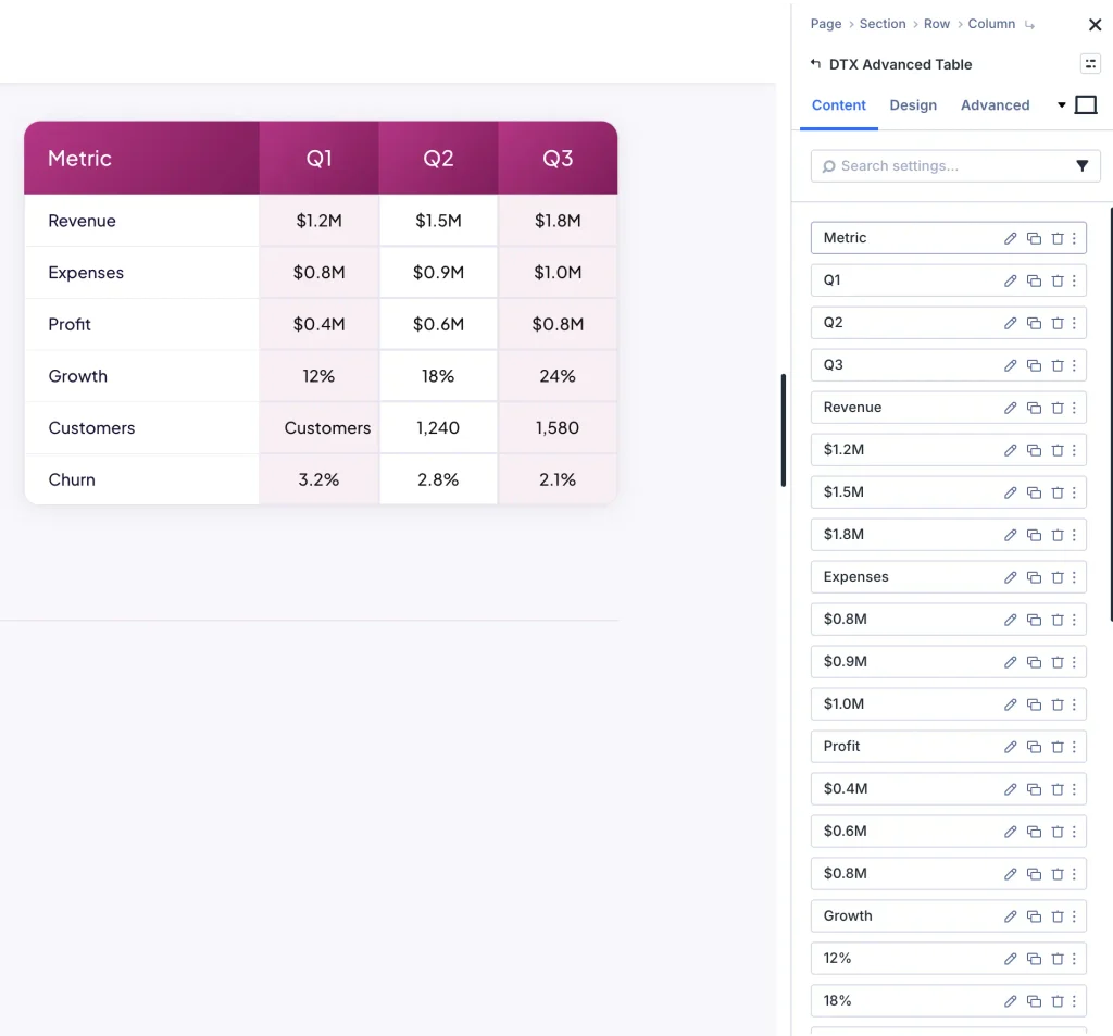
Table
- Number of Columns:
- Control Type: Number Input Field (e.g.,
4) - Description: Set total number of table columns.
- Control Type: Number Input Field (e.g.,
- Number of Header Rows:
- Control Type: Number Input Field (e.g.,
1) - Description: Set number of top rows designated as table header rows.
- Control Type: Number Input Field (e.g.,
- Number of Header Columns:
- Control Type: Number Input Field (e.g.,
0) - Description: Set number of left columns designated as table header columns.
- Control Type: Number Input Field (e.g.,
- Number of Footer Rows:
- Control Type: Number Input Field (e.g.,
0) - Description: Set number of bottom rows designated as table footer rows.
- Control Type: Number Input Field (e.g.,
Table Scrolling
- Enable Sticky Headers:
- Control Type: Toggle (ON / OFF)
- Description: Lock header rows/columns in place while scrolling through large tables.
- Sticky Headers Type:
- Control Type: Dropdown (Headers for Columns, Headers for Rows)
- Description: Select which headers remain sticky during table scroll.
- Table Max Height:
- Control Type: Range Slider (e.g.,
250px) - Description: Set maximum container height for scrollable tables.
- Control Type: Range Slider (e.g.,
- Enable On Responsive:
- Control Type: Toggle (ON / OFF)
- Description: Enable responsive horizontal/vertical table scrolling on mobile viewports.
Link and Element label
- Module Link URL & Target: Set destination link URL and target window for the entire table module.
- Element Label (Admin Label): Enter custom label for easy module identification in Divi Builder layout view.
Design
Header and cell styling
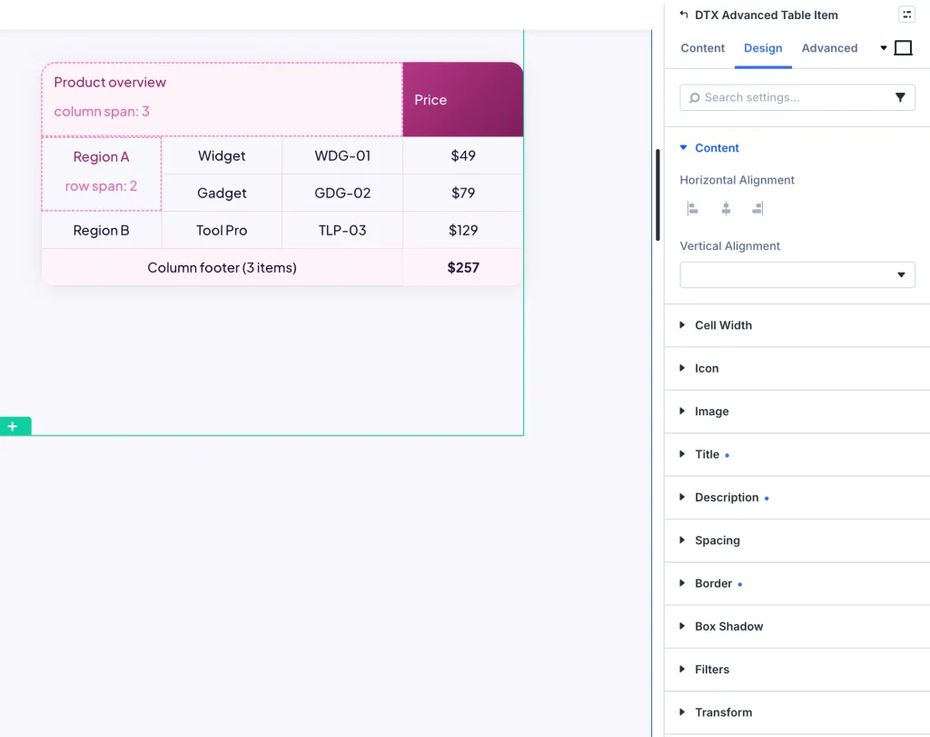
- Header Rows: Background color, content horizontal alignment (Left, Center, Right), vertical alignment (Top, Center, Bottom), cell max/min width, margin, padding, and border radius.
- Header Rows Titles & Description: Customize font family, weight, text size, color, line height, and letter spacing.
- Header Columns & Footer Rows: Independent background colors, alignment, cell width, padding, border radius, and text typography for column headers and footer rows.
- General Cells: Background colors, zebra striping, padding, border radiuses, title typography, and body text typography for standard data cells.
Media and tooltip styling
- Table Icons and Images: Icon size, icon color, image width, and image alignment.
- Tooltip Accordion: Tooltip background color, text color, padding, border radius, and box shadow.
- Stripe Buttons: Custom button styling for interactive table action elements.
Advanced tab
Configure custom CSS ID & Classes, element-level Custom CSS (Table, Header Row, Header Cell, General Cell, Tooltip, Icon, Image), and responsive Visibility rules.