Search Divi Menu Extended Documentation
Search for answers or browse our knowledge base.
Module
Overview of the Divi Menu Extended module
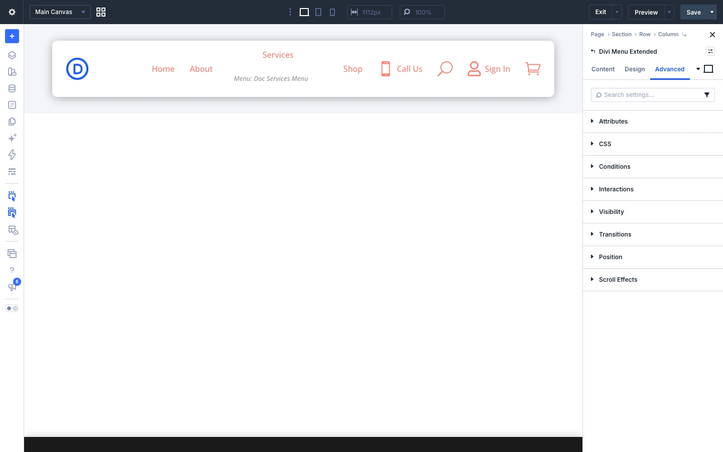
This page shows you how to add the Divi Menu Extended module to your page and explains every setting of the menu and its menu items. Divi Menu Extended builds a complete header menu in Visual Builder: a logo, text links, dropdowns and mega menus, a live search box, a WooCommerce cart with a mini cart, an account link, contact and social links, and popups, with a mobile hamburger menu built in.
The plugin adds two modules:
- Divi Menu Extended: the parent module. It holds the menu items and controls the layout, the mobile hamburger menu and the shared styling.
- Menu Item: each item inside the menu. Every item has its own content (logo, text, icon or image) and its own link type (URL, contact, search, cart and more).
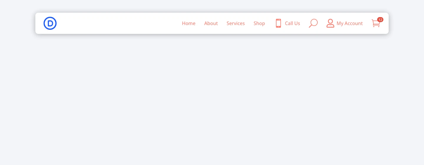
How to add the Divi Menu Extended module to your page
- Open your page (or your header in the Theme Builder) in the Divi Visual Builder.
- Click the gray (+) icon inside a row to add a new module.
- Search for Divi Menu Extended in the module search box.
- Click the module to insert it. Its settings open on the right.
- Add your menu items under Content → Menu Items (see below).
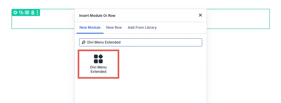
1. Divi Menu Extended (parent module) settings
Content tab
The Content tab of the parent module has the Mobile & Collapse and Menu Items groups. Background, Order and Meta are the standard Divi options.
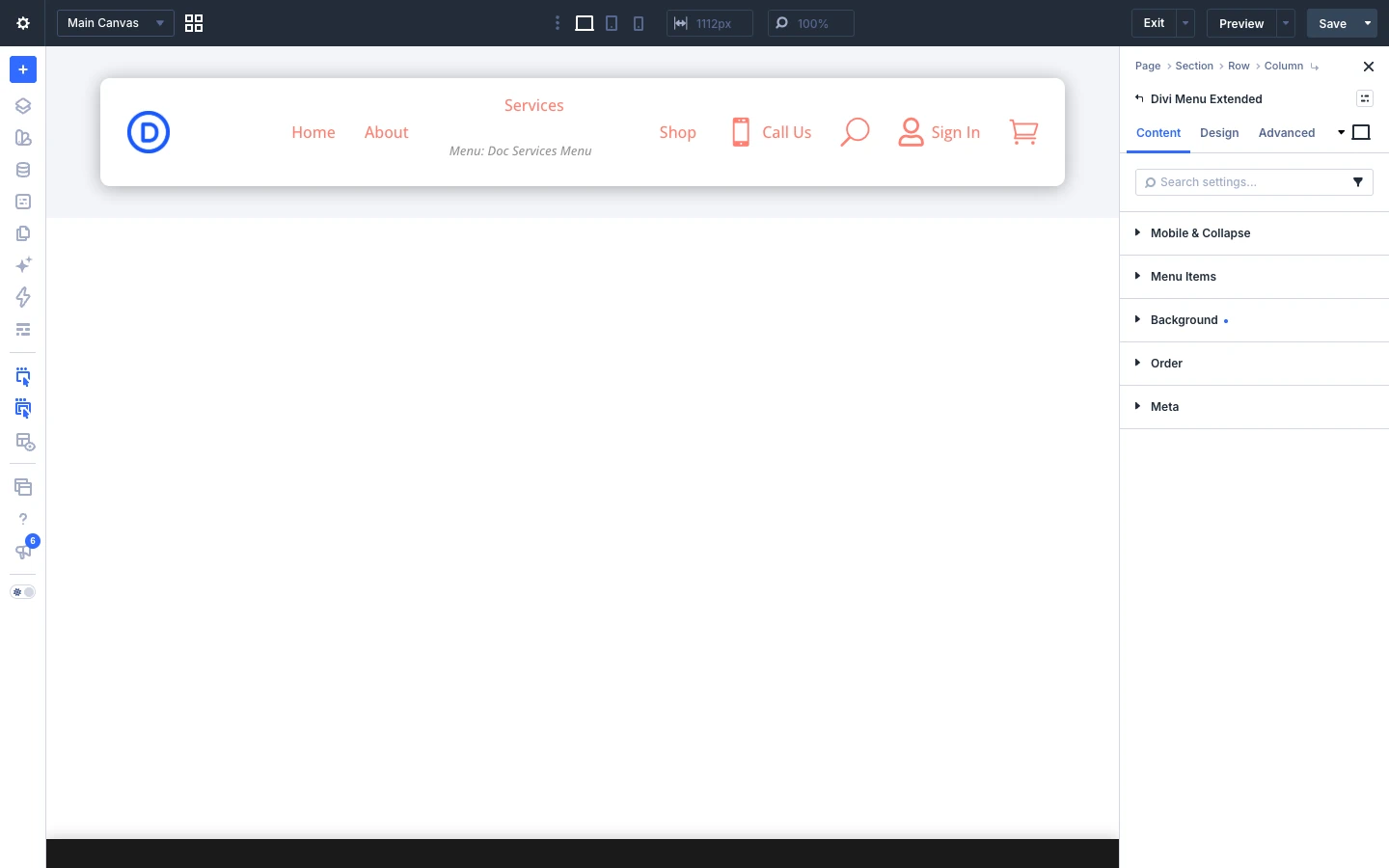
Mobile & Collapse
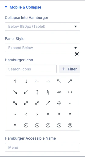
- Collapse Into Hamburger: When the menu items fold away behind a hamburger button: Never, Below 980px (Tablet), Below 767px (Phone) or Always. Choose Always to build a slide-in or full-screen menu on every screen size.
- Panel Style: How the collapsed items open. Expand Below opens them directly under the menu bar and pushes the page down (the usual mobile menu). Slide In covers one side of the screen and dims the page behind it. Fullscreen covers the whole screen and fades the items in one after another.
- Slide In From: Only for Slide In. Choose whether the panel slides in from the Right or the Left.
- Hamburger Icon: Optional. Leave it empty to use the drawn three-bar hamburger, or pick your own icon.
- Hamburger Accessible Name: The text screen readers read out for the hamburger button (default “Menu”).
This is how the menu looks on a phone with Below 980px (Tablet) and Expand Below:
Menu Items
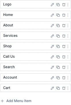
All the items of the menu are listed here. Click Add Menu Item to add a new item, click the pencil icon of an item to open its settings, and drag items to change their order.
Design tab
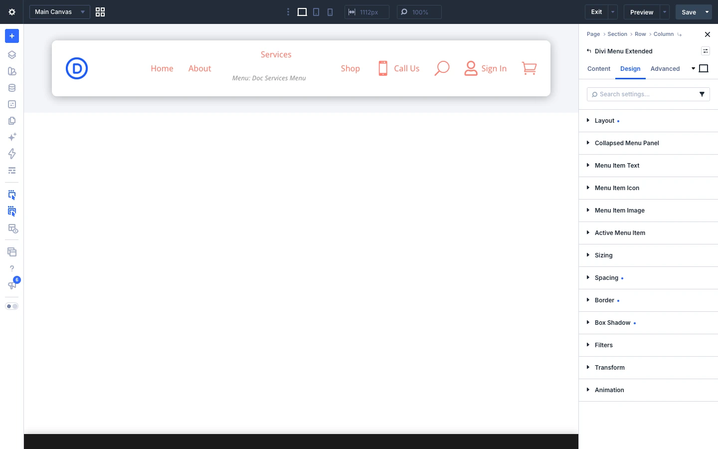
The Design tab sets the layout of the menu bar and the styling shared by all items. The groups after Active Menu Item (Sizing, Spacing, Border, Box Shadow, Filters, Transform, Animation) are the standard Divi design options.
Layout
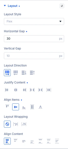
Uses Divi 5’s layout options to arrange the menu items. Layout Style can be Flex (default), Grid or Block. Flex places the items in a row or column, with Horizontal Gap, Vertical Gap, Layout Direction, Justify Content, Align Items and Layout Wrapping controls. Grid arranges them in columns and rows. Block stacks every item at full width, which suits a vertical sidebar menu.
Collapsed Menu Panel
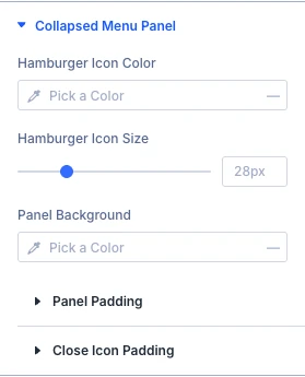
Styles the hamburger and the mobile panel: Hamburger Icon Color, Hamburger Icon Size, Panel Background, Panel Padding and Close Icon Padding. With the Slide In or Fullscreen panel style, more settings appear for the panel’s close button (color, background, corner radius, size and position); Slide In Width and Backdrop Color appear only for Slide In.
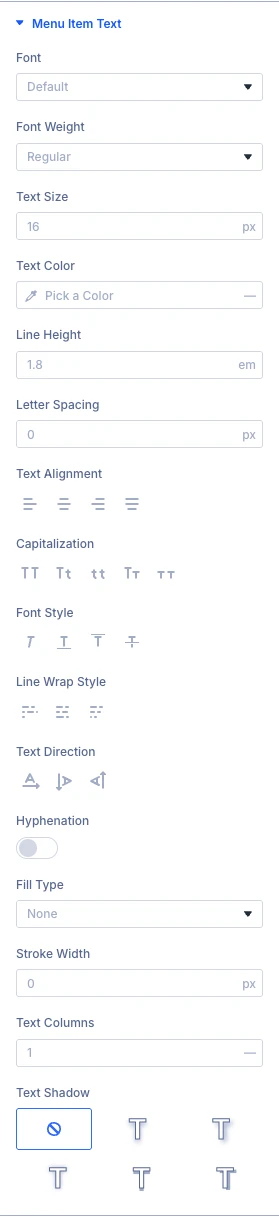
Menu Item Text, Menu Item Icon and Menu Item Image
Set the text font, the icon style and the image size once here for every item. A single menu item can still override these in its own Design tab. Image Height under Menu Item Image keeps a row of image items the same height (50px when empty).
Active Menu Item
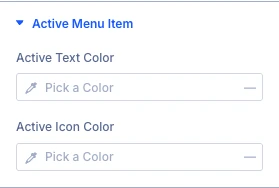
- Active Text Color: Text color of the item that links to the page being viewed.
- Active Icon Color: Icon color of that same item. Leave both empty and no active styling is added.
2. Menu Item (child module) settings
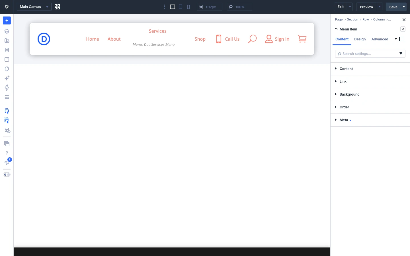
Open a menu item by clicking its pencil icon in the Menu Items list. Every item has a Content group (what the item shows) and a Link group (what it does when clicked).
Content
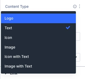
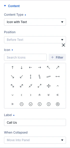
- Content Type: What the item shows: Logo, Text, Icon, Image, Icon with Text or Image with Text.
- Label: The text of the item (for the types that include text).
- Icon / Image: The icon or image of the item (for the types that include one).
- Position: For Icon with Text and Image with Text: where the icon or image sits, Before Text, After Text, Above Text or Below Text.
- When Collapsed: What happens to this item when the menu folds into the hamburger: Move Into Panel, Stay Visible (for example, keep the cart or search icon in the bar) or Hide.
With Logo selected, two more settings appear:
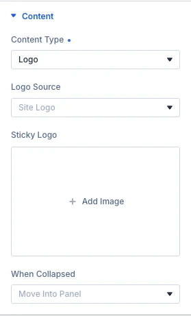
- Logo Source: Site Logo uses your site’s logo (WordPress Customizer → Site Identity, or Divi → Theme Options → Logo), so changing it there updates every menu. Custom Upload uses an image chosen just for this item.
- Sticky Logo: Optional. A different logo shown once the header becomes sticky, for example a smaller version.
Link
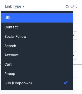
Link Type sets what the item does. The settings below it change with the link type you choose.
URL
- Link URL: The page or website the item opens.
- Link Target: Open the link in the same window or a new tab.
Contact
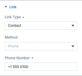
- Method: Phone, Email, WhatsApp or SMS. Phone and SMS open the device’s own apps; WhatsApp opens wa.me in a new tab.
- Phone Number: Include the country code for WhatsApp. Spaces, brackets and dashes are removed automatically.
- Email Address, Subject: For Email. The subject is optional and pre-fills the email.
- Message: Optional. Pre-fills the WhatsApp or SMS message.
Social Follow
- Network: The social network. Choosing a network sets its brand icon automatically, unless you have picked your own icon.
- Profile URL: The full address of your profile, for example https://instagram.com/yourname.
- Open In New Tab: Open the profile in a new tab (on by default).
Search
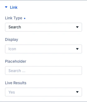
- Display: Icon shows a magnifier that opens the search box. Inline Box keeps the search box open in the menu.
- Collapse To Icon Below: For Inline Box: below this width the box turns back into the icon (Tablet (980px), Phone (767px) or Never).
- Placeholder: Text shown in the empty search field.
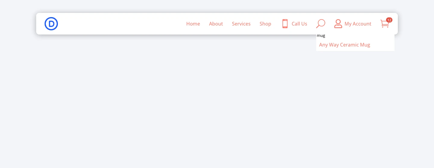
- Live Results: Shows matching posts, pages and products while the visitor types. Turn it off for a plain search box, for example on a very large store.
Account
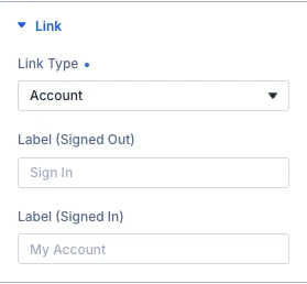
- Label (Signed Out): Text shown to visitors who are not logged in (default “Sign In”).
- Label (Signed In): Text shown to logged-in visitors (default “My Account”). Use
%%display_name%%to show their name, for example “Hi %%display_name%%”.
The labels only show when the Content Type includes text, for example Icon with Text.
Cart
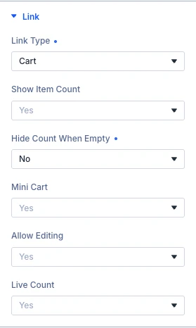
- Show Item Count: Shows a badge with the number of items in the WooCommerce cart.
- Hide Count When Empty: Hides the badge while the cart is empty instead of showing 0.
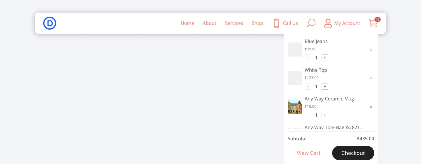
- Mini Cart: Opens a panel with the cart items, subtotal, View Cart and Checkout buttons. Turn it off to go straight to the cart page.
- Allow Editing: Lets visitors change quantities and remove items inside the mini cart.
- Live Count: Keeps the count correct on cached pages and updates it when a product is added without a page reload.
Popup
Opens a Divi 5 Canvas as a popup over the page. Choose the Canvas Portal to open and the Trigger (Click or Hover). In the Design tab you can set the Popup Position (nine positions, Center by default), Edge Offset, Width, Backdrop Color, Animation (None, Fade, Slide, Zoom, Bounce, Flip, Fold or Roll), Animation Direction, Animation Duration and the close button. See section 3 for how to create the Canvas.
Sub (Dropdown)
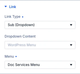
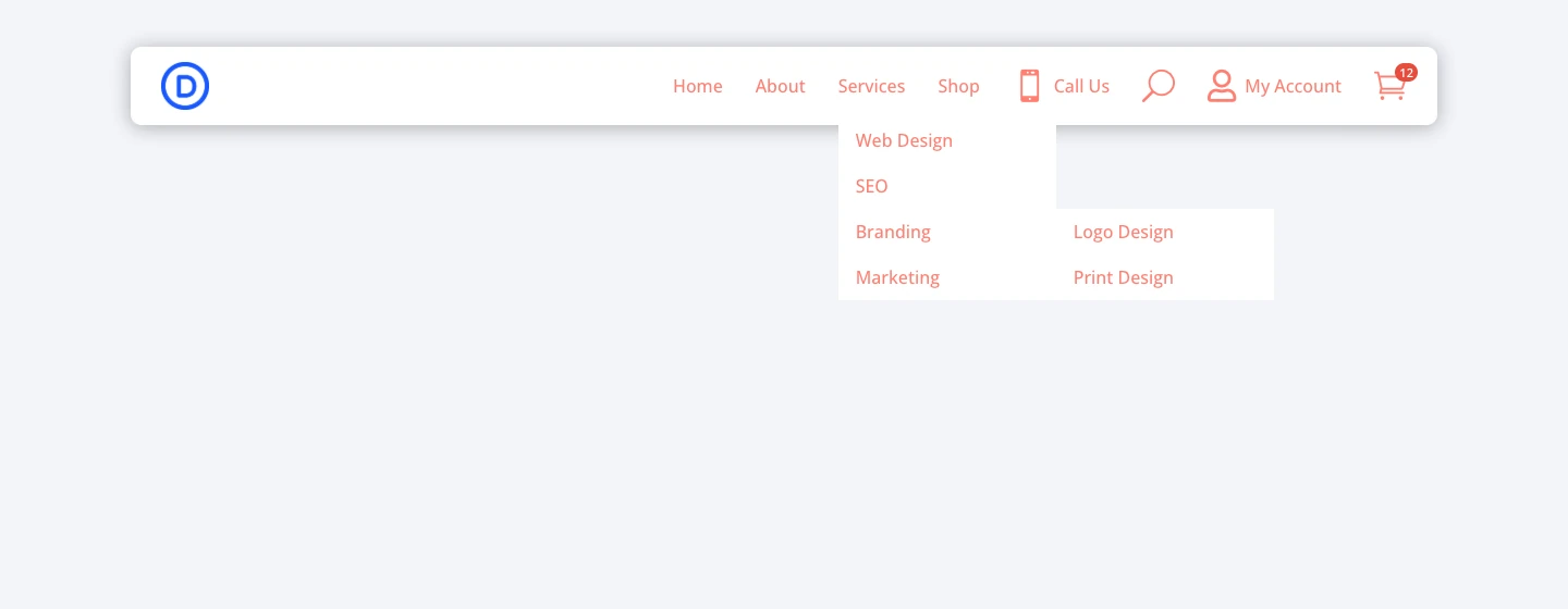
- Dropdown Content: WordPress Menu shows one of your menus as a dropdown. Canvas (mega menu) shows a Divi 5 Canvas as a mega menu panel.
- Menu: For WordPress Menu: the menu to show. Manage menus under Appearance → Menus. Sub-items of the menu open as a second level. The dropdown opens on hover on desktop and on tap on touch devices.
- Canvas: For Canvas (mega menu): the Canvas to show as the mega menu.
Design tab
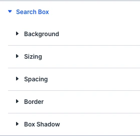
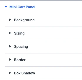
The Design tab of a menu item shows only the groups that apply to its content type and link type. For example, a Search item has the Search Box groups and a Cart item has the Cart Badge and Mini Cart groups. The groups from Sizing onward are the standard Divi design options.
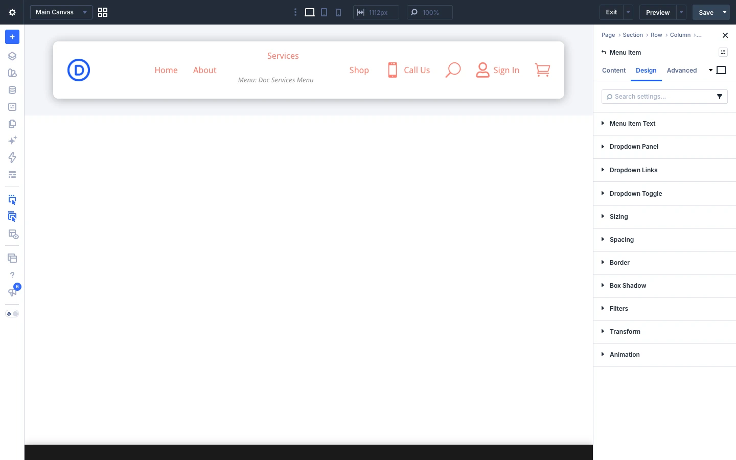
- Layout: For items with an icon or image and text: Content Alignment (Left, Center, Right). It has an effect when the icon or image is stacked above or below the text, or when the item has a width set under Sizing.
- Logo: Logo Height (50px by default); the width follows automatically.
- Icon: Icon size, color and background.
- Menu Item Text: Font settings for this item’s label.
- Dropdown Panel, Dropdown Links, Dropdown Toggle: For Sub (Dropdown) items: the dropdown panel, the links inside it, and the arrow toggle that opens sub-items (icon color, icon size, background, spacing and border).
- Cart Badge: Font, background and shape of the cart count badge.
- Mini Cart Panel, Mini Cart Item, Mini Cart Subtotal, Button: Styling of the mini cart.
- Search Box, Search Field, Search Results, Search No Results: Styling of the search box, the input field, the live results and the “No results found” message.
- Popup / Mega Menu: For Popup and Canvas mega menu items: backdrop, width and the close button.
3. How to use Divi 5 Canvas Portals for mega menus and popups
In Divi 5, a Canvas is a separate workspace in the Visual Builder. A Canvas Portal module shows the content of a Canvas on your page. Divi Menu Extended uses them for mega menus and popups.
Step 1: Create a Canvas
- In the Visual Builder top bar, open the Canvas dropdown (it shows Main Canvas) and click + Add Canvas.
- Enter a name, for example Products Mega Menu or Newsletter Popup. Turn on Global if the same mega menu is used on every page.
- Build the content with sections, rows and modules, then click Save.
- Switch back to the Main Canvas.
Step 2: Connect the Canvas to a menu item
- Add a Canvas Portal module to your page and select your Canvas in it.
- Open the menu item in Divi Menu Extended.
- For a mega menu, set Link Type to Sub (Dropdown), Dropdown Content to Canvas (mega menu), and choose the Canvas.
- For a popup, set Link Type to Popup, choose the Canvas Portal and the Trigger (Click or Hover).
- Save the page and check it on the frontend.
4. Advanced tab settings
The Advanced tab has the standard Divi options for both modules: CSS ID & Classes, Custom CSS, Attributes, Conditions, Interactions, Visibility, Transitions, Position and Scroll Effects.